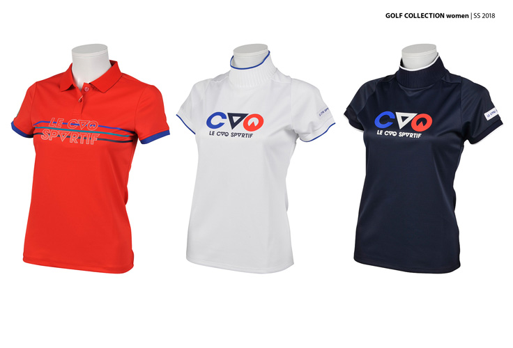
DESCENTE LTD. is a Japanese sportswear and accessories
company, based in Tokyo and Osaka. Its brands include Descente, Le Coq Sportif, Arena, Munsingwear, Umbro, Inov-8, Movesport, Lanvin Sport and Srixon (own brand, purchased or
licensed).
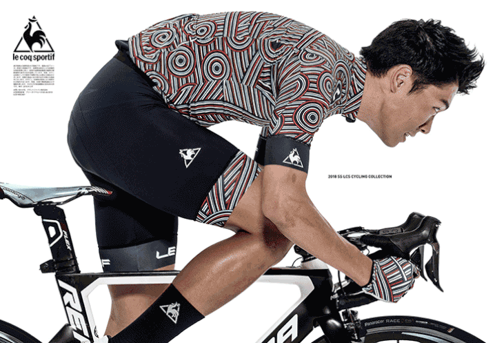
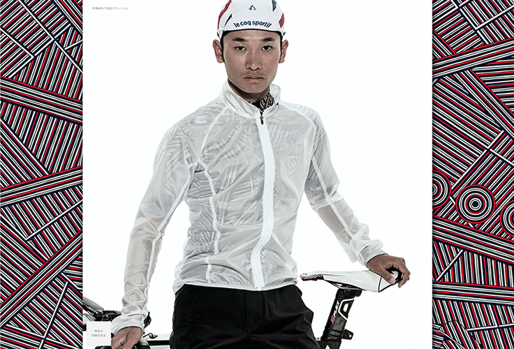
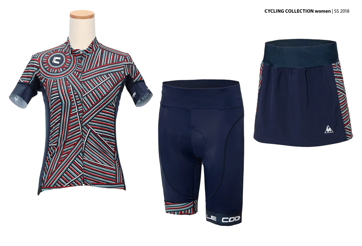
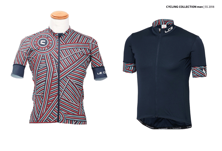
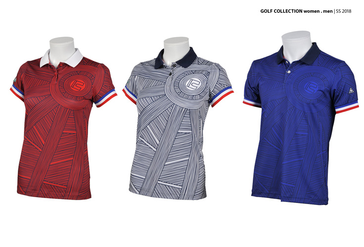
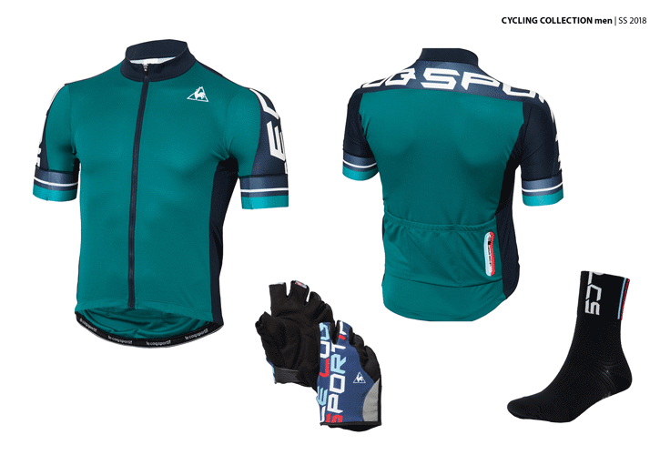
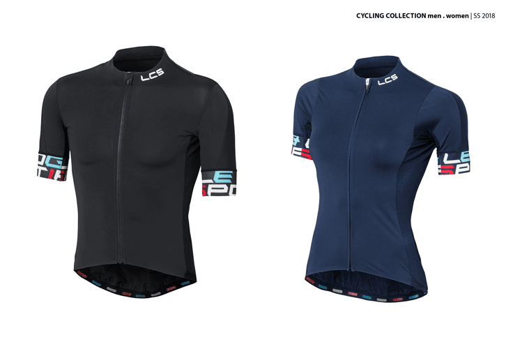
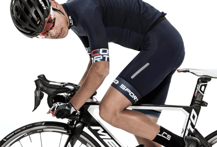
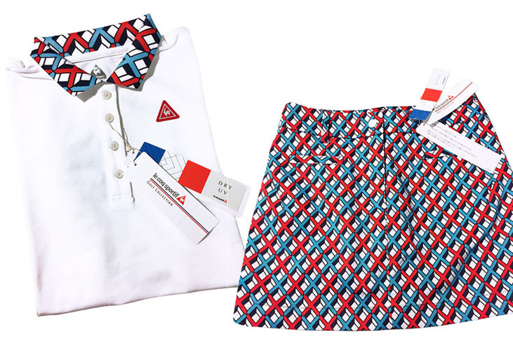
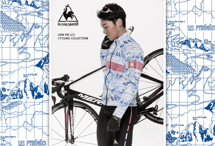
I had the pleasure of creating several pattern designs for LE COQ SPORTIF (Cycling & Golf). The company was so pleased with my first
realisation ("Les champs de Paris", SS2018) that they commissioned me for two more orders in a row ("Paysage Tourmalet", FW 2018 & "Air swirls", FW 2019) – what more
beautiful feedback could there possibly be?! I loved to realize these artworks as it was a really creative process.
Incidentally, the company was founded in 1935 by Takeo Ishimoto in Osaka and today has almost 3,000 employees. Descente Ltd. sells its brands mainly on the Asian market, but also in Europe and
North America.


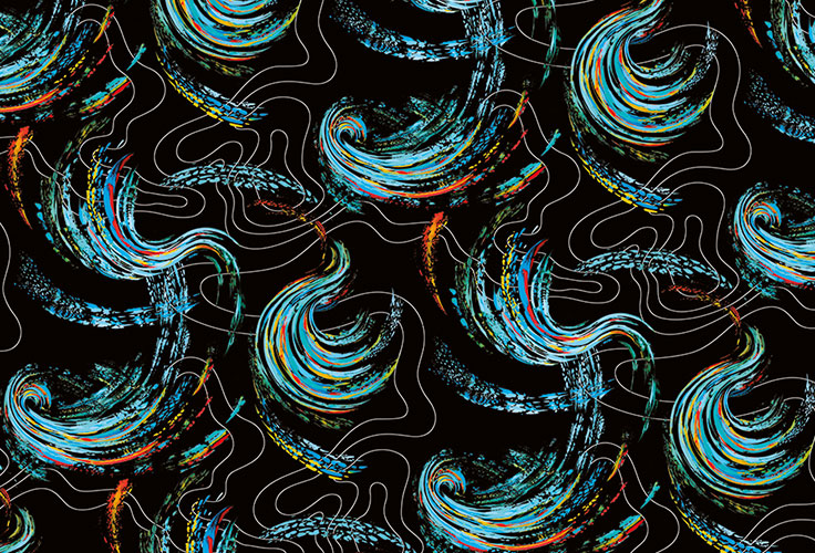
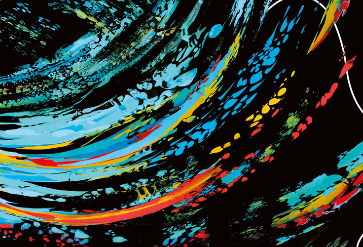
In this artwork I realized the idea of a dynamic air movement. As it was destined for the cycling collection of Le Coq Sportif, it’s an expression of a cyclist in motion, the airflow and
speed.
I found my inspiration mainly in weather maps, where the nature of the most diverse cloud formations captured my attention – from their compact density over lighter fluffy forms to very thin
veils, largely extended all over the sky.
Especially the dynamic movement of very big air swirls and whirlwinds fascinated me.
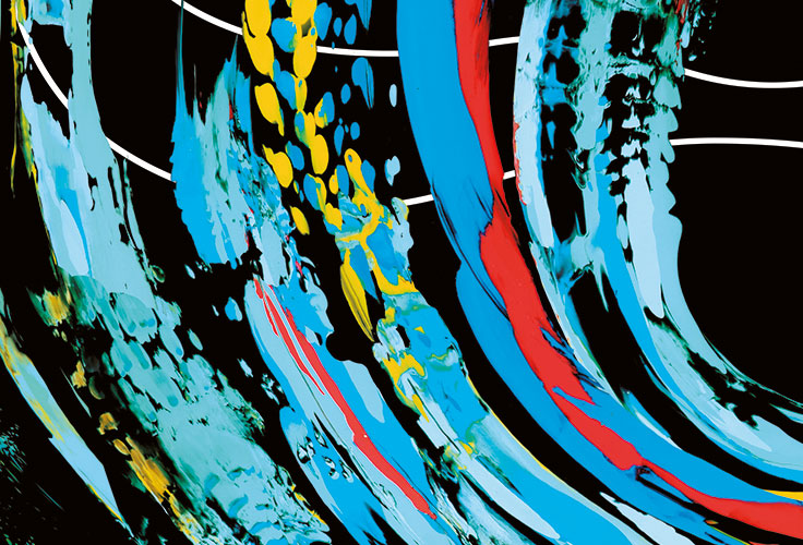
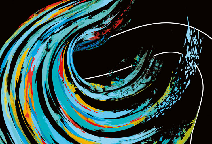
For the final execution I used acrylic color and a special technique which allowed me to catch these particular characteristics. I managed the different colors to intermix themselves, as do the
layers of the clouds, and to bring out the various structures and the speed of the wind.
Beyond the clouds I got inspired by another structure: the so-called isobars (lines displaying the air pressure). I loved their wavelike irregular movement, remembering of a route
snaking around the mountains. They were a great contrast to the dynamic colorful airflow. So I combined them in clear lines with my clouds on a separated layer. This way the artwork gained more
depth and contrast in color and expression:
neutral white & mixed colors, slow movement & high speed.
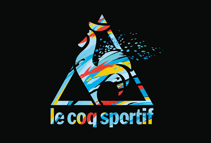
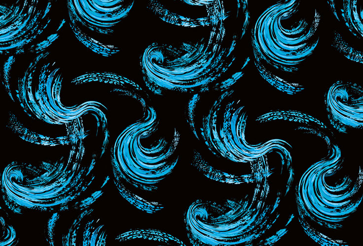
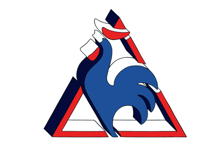
Descente Ltd. asked me to create two variations with only the clouds – one in black and blue and one as a negative visual, as well as a colorful version of the logo of "the cock".
All-over pattern and logo design: acrylic painting, digitally arranged


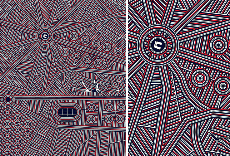
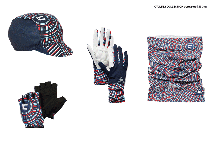
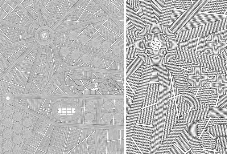
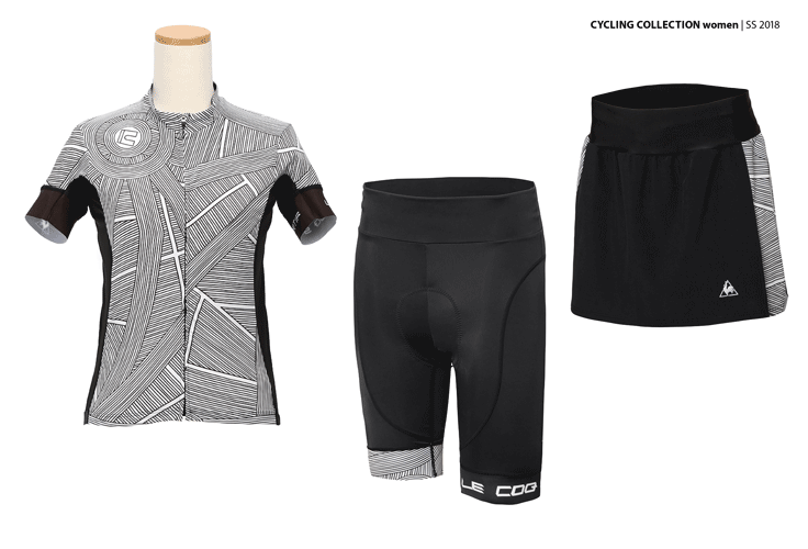
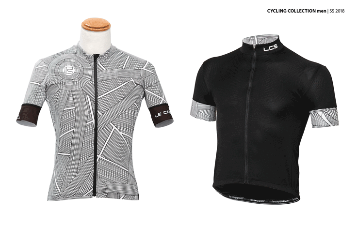
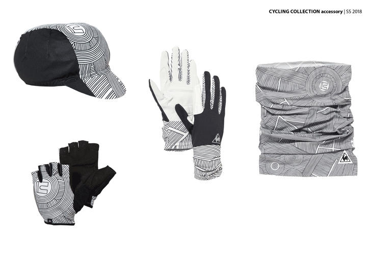
The illustration is based on the structure of the 16th arrondissement of Paris. This arrondissement (or urban district) is probably the most important one for main sport events – as the arrival of the Tour de France on the Champs Élysées, the French Open "Roland Garros", or the Paris Marathon (whereof nearly 14km are running through).
The "16th" is also known for beeing very "chic". And here is where LVMH opened its museum "Fondation LVMH" in 2014.
So in the illustration you can find the wide avenue of the Champs-Élysées in the North, bordered by trees, and the "place
d’Étoiles" (today place Charles-de-Gaule), raying into the city with its 12 avenues. The foundation of LVMH (which in fact is placed in the "Bois de Boulgne" in the East), with its beautiful
sails. The sports grounds of the French Open "Roland Garros" in the South with its main tennis court surrounded by nature.
The city of Paris is always in movement. Lines seemed a perfect way to reflect that
dynamic. And its architecture is particularly beautiful and homogeneous. So I wanted to reflect that harmony in my artwork, creating a balance between all lines and forms. The word "Champs" from
Champs-Élysées means "fields" by the way.
Placed pattern & logo design and adaption: handdrawn illustration, digitally
colored


For this artwork I found my inspiration in nature : the beautiful geometry of honey combs and the perfection of symmetry of the French formal gardens (« jardins à la française »). So I played with the elements until I got a great depth effect and harmony between form and colours.
Repeat pattern and logo design: handdrawn illustration, digitally colored


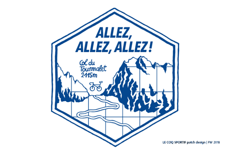
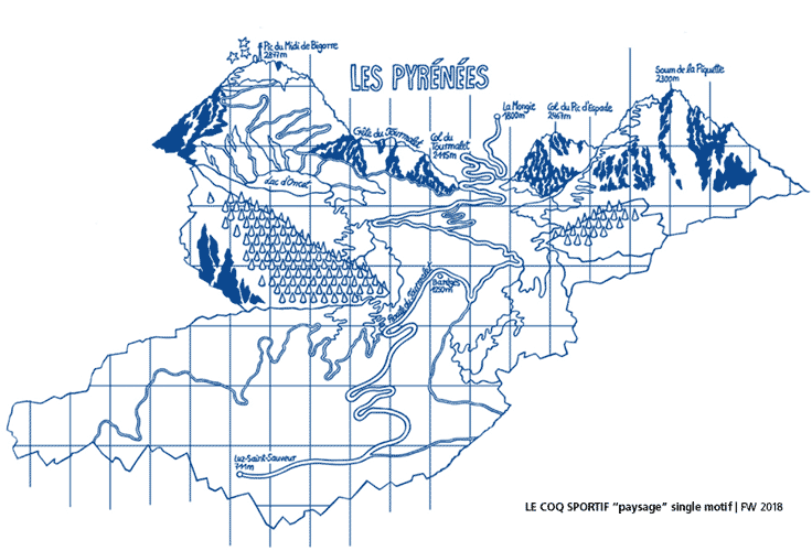
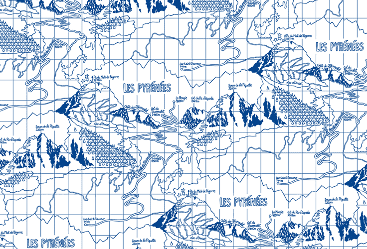
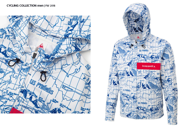
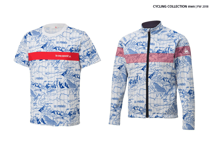
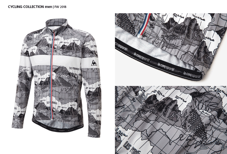
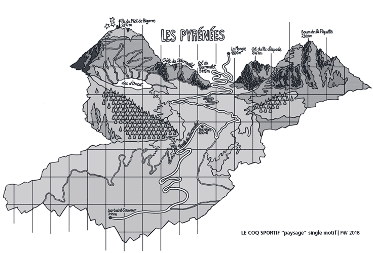
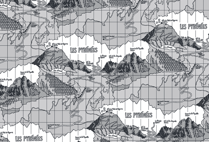
This artwork is based on the circuit of Tour de France – the toughest section of the race track leads through the Pyrenees with its high peaks to climb. One of the most famous ones is the
Tourmalet with its particularly steep and winding road – up to its mountain pass at 2115m.
The classic Tourmalet stage begins in Luz-Saint-Sauveur (711m) and climbs steeply just behind Barèges. Between Barèges and the summit, the route winds through narrow serpentines in a beautiful
mountain landscape, and from there winds down to the famous mountain station La Mongie (1800m).
For the illustration I got inspired by documentation, classic maps and more modern devices such as Google earth. Than I reduced it to simple lines, keeping the most characteristic properties of the racetrack and its mountain landscape – such as the highest mountain peaks that frame the Tourmalet mountain pass, including the Pic du Midi de Bigorre (2877m), known for its observatory and the television station on its peak. "Paysage Tourmalet" can be translated by "Tourmalet landscape".
Repeat pattern and patch design: handdrawn illustration, digitally colored
www.kristinawiessner.com
GER +49(0)1 57 38 92 18 69
FR +33(0)7 88 92 85 05
© 2024 kristinawiessner all rights reserved


